
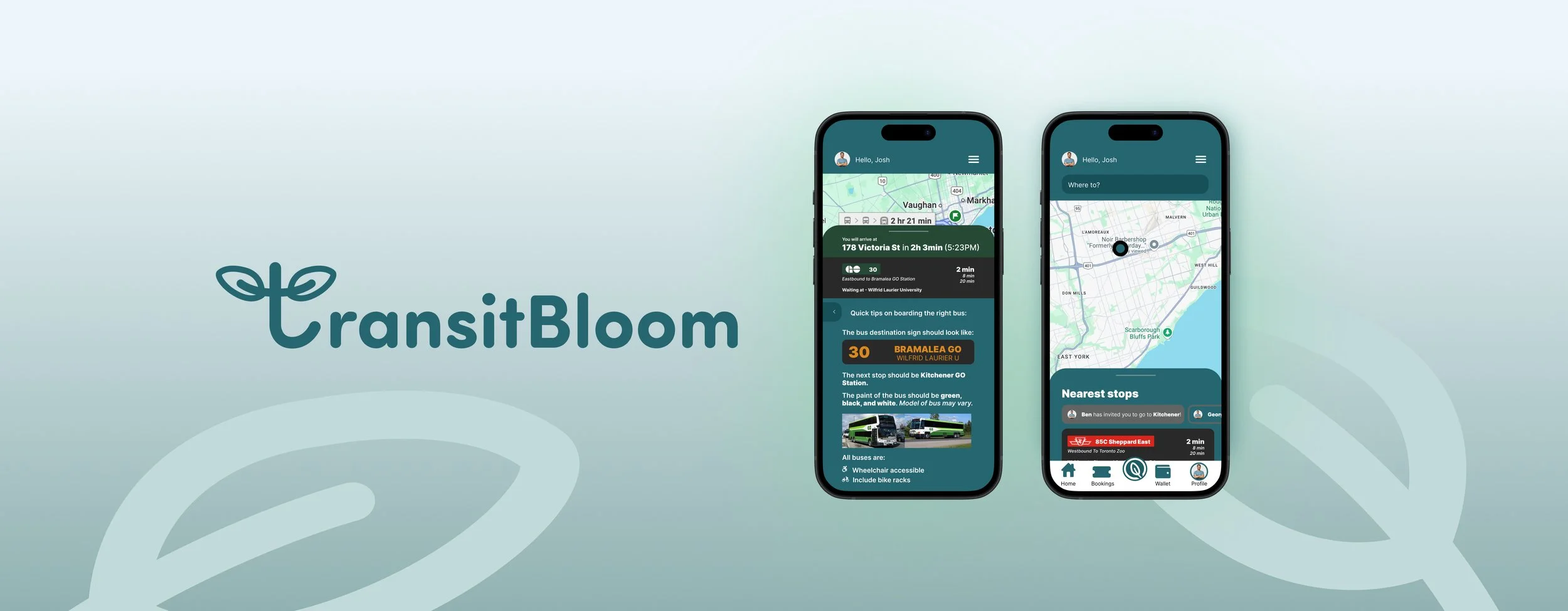
🥉 3rd place - UXL Blueprint Competition
Designing a sustainable and accessible travel app.
Despite a growing interest in eco-friendly transit, many commuters still rely on unsustainable travel options. Difficult transit systems, unreliable schedules, and accessibility issues make greener choices feel more difficult for everyday use.
OVERVIEW
TOOLS
Figma, Photoshop, Adobe Illustrator, Procreate
MY ROLE
Product Designer, UX Researcher
TIMELINE
Nov 2024 (3 week design challenge)

DESIGN CHALLENGE
How might we design sustainable travel options that increase efficiency while enhancing the quality of life for daily commuters?
THE SOLUTION
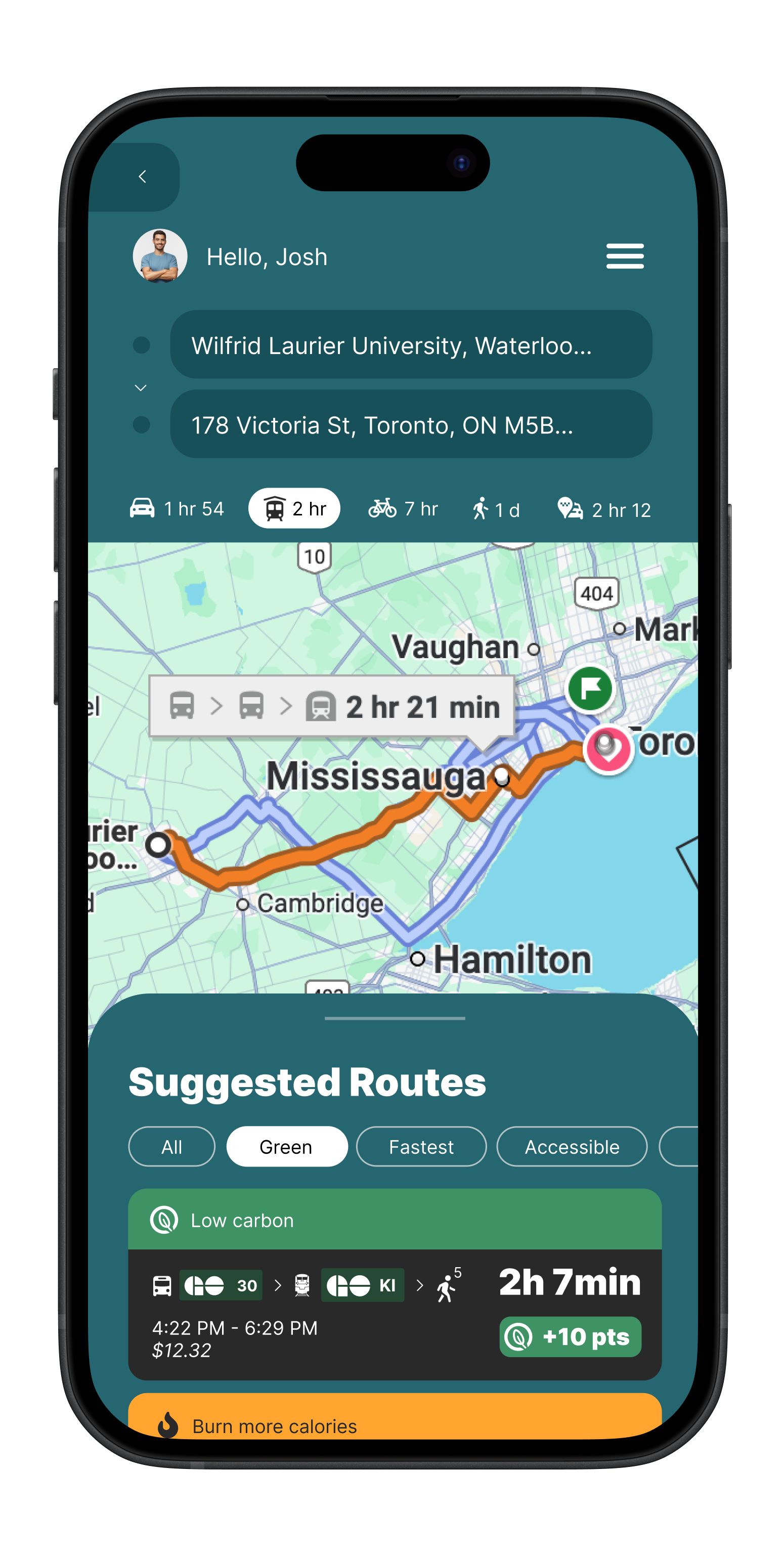
Route planning
Routes that account for accessibility conditions and sustainability impact
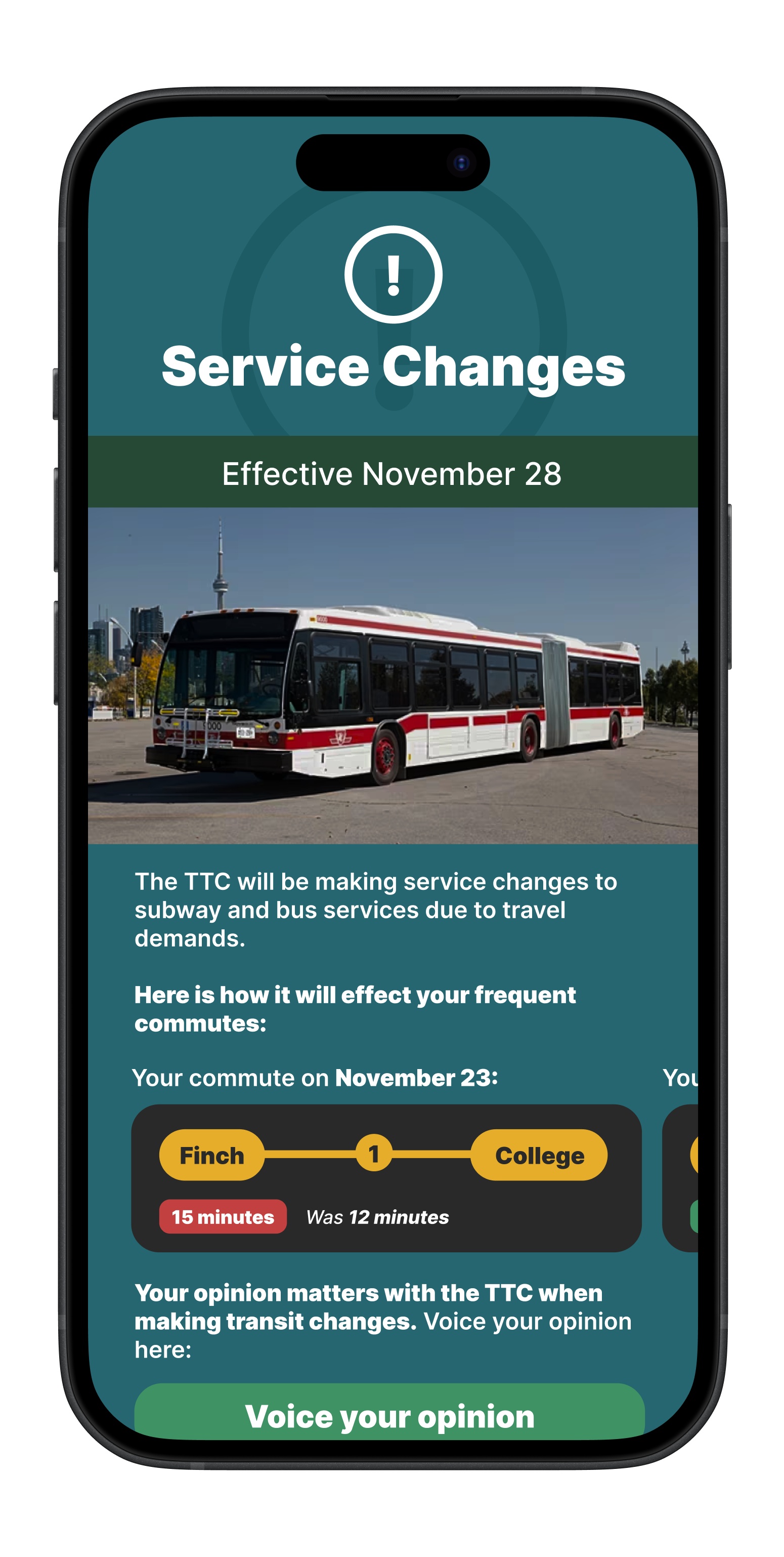
Know about changes before they affect you, and share your feedback
Service alerts
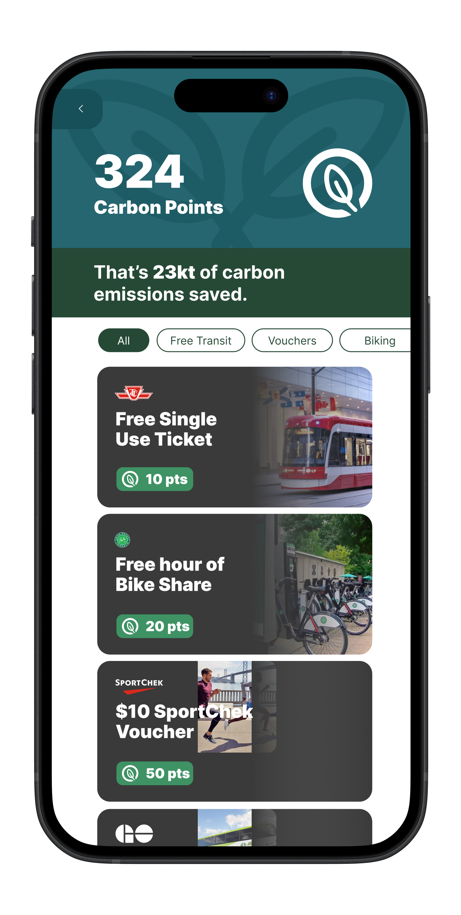
Eco-rewards system
Track your environmental impact, earn Carbon Points, and redeem rewards
PROCESS
Competitor Analysis
We first looked at what our competitors do well:

Clean, minimal interface
Competitors prioritize simplicity and lets users plan trips without visual clutter.
Detailed transit directions
Competitors provide detailed guidance that walk users through their journey and reduce uncertainty for first-time riders.
Reliable real-time updates
Competitors pull live data across buses, trains, and other transit modes, keeping arrival times as accurate as possible.
RESEARCH
Why aren’t there more sustainable-forward transit apps?
We studied 2 key groups:
01
Students who value speed and affordability
02
Seniors who require accessible routes
The real problem behind daily commuting
Speaking with commuters showed that the challenge was more about uncertainty, stress, and lack of control. Students felt overwhelmed by unreliable transit systems, often relying more on Uber or driving because it felt more predictable. Seniors and users with mobility needs shared how inaccessible stations made many trips feel frustrating.
After, we figured out that commuting decisions were heavily shaped by convenience, and whether the transit system feels like it supports you.
SUMMARY OF INSIGHTS
Reliability and convenience are more important than simply having sustainable options available. If transit feels confusing or inconsistent, people are far less likely to choose it regardless of environmental benefits.
DEFINE
Redesigning Transit Around Real Barriers
Commuters don’t dislike sustainable transit— they just feel unsupported by already existing tools. Current apps do not address these three things: accessibility, motivation, and uncertainty. So, we defined TransitBloom as an experience that connects real-time information, inclusive route planning, and eco-incentives.
PROBLEM STATEMENT
“Commuters face unreliable, inaccessible, and uninspiring transit experiences that make sustainable travel feel inconvenient and uncertain.”
DESIGN FOCUS
Reduce uncertainty with real-time updating routes
Support diverse mobility needs
Motivate greener choices through rewards
DESIGN
Low-Fidelity
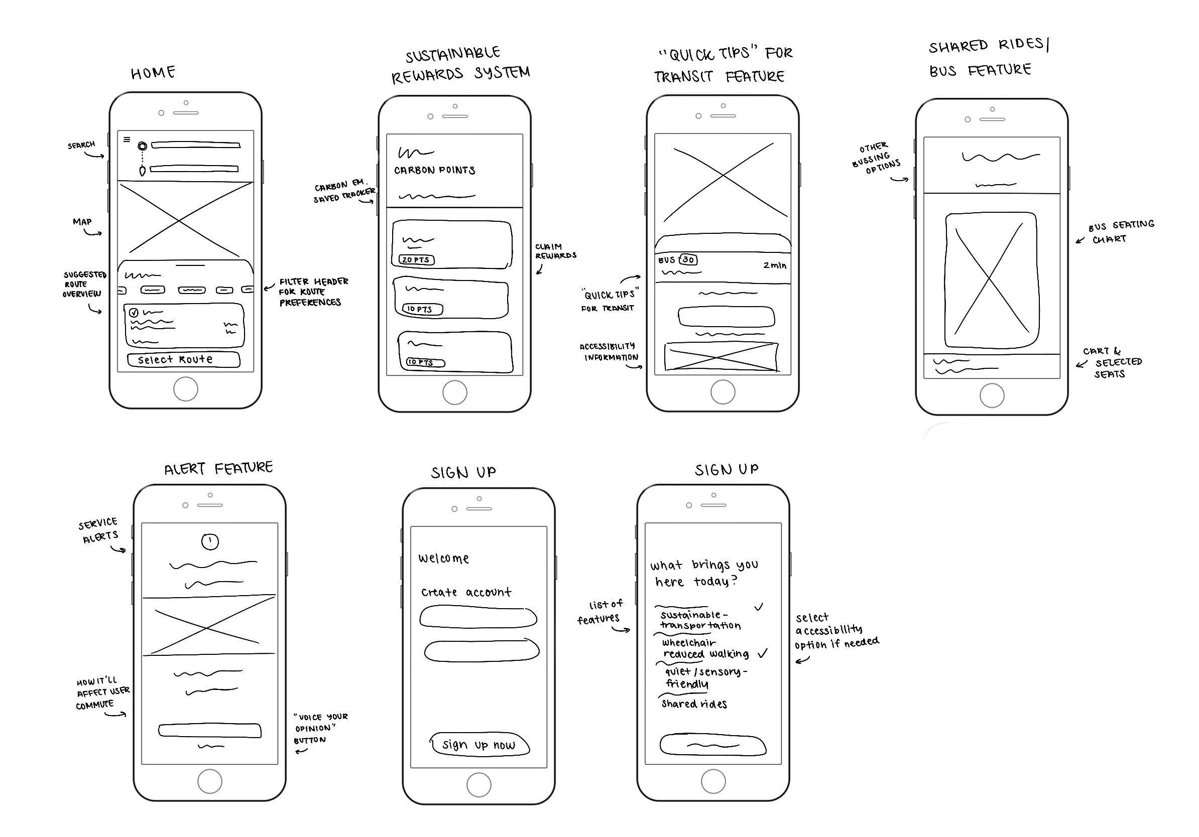
Early iterations
Med-Fidelity
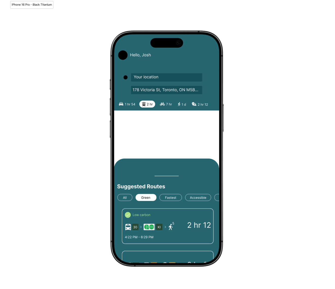
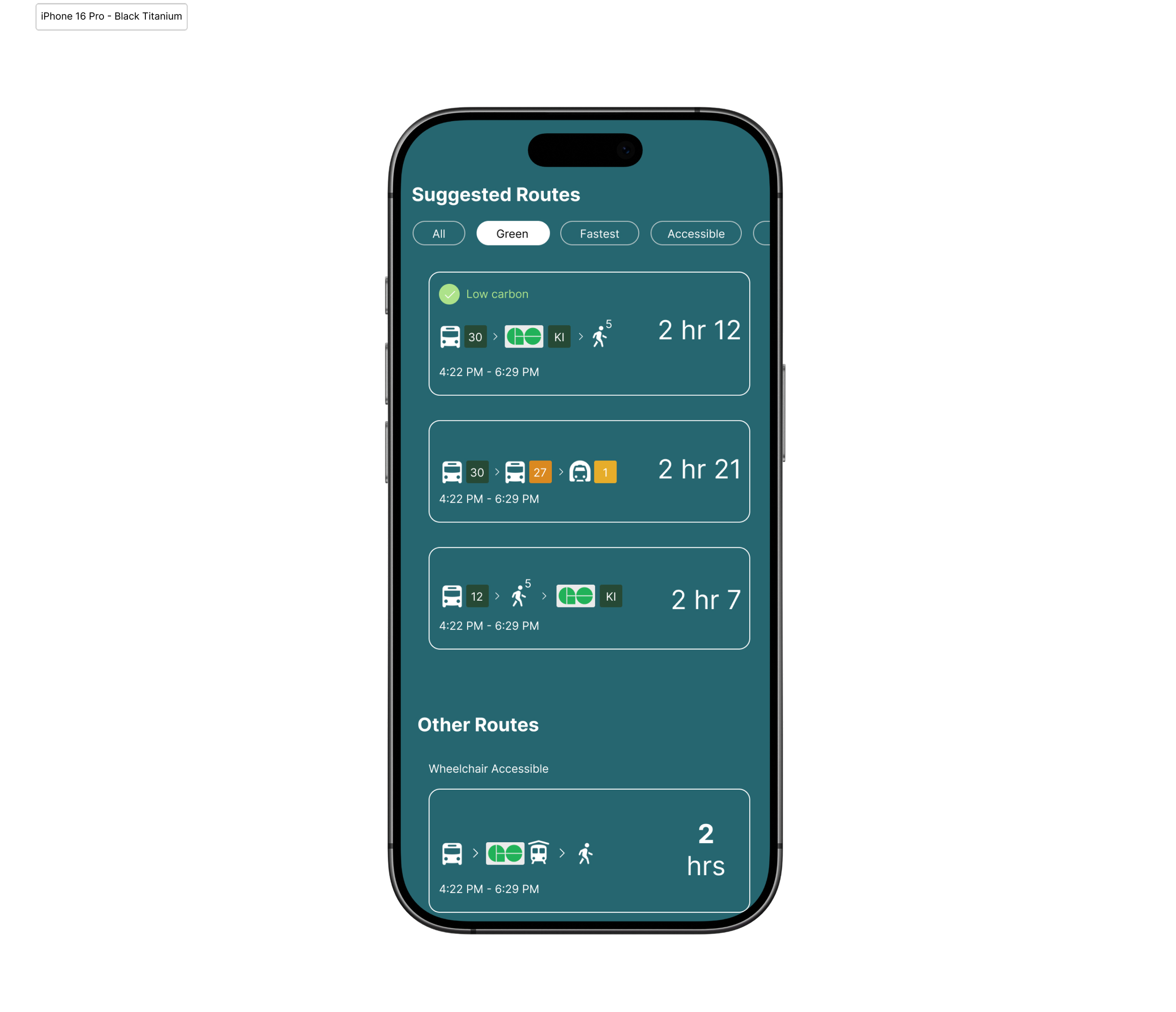
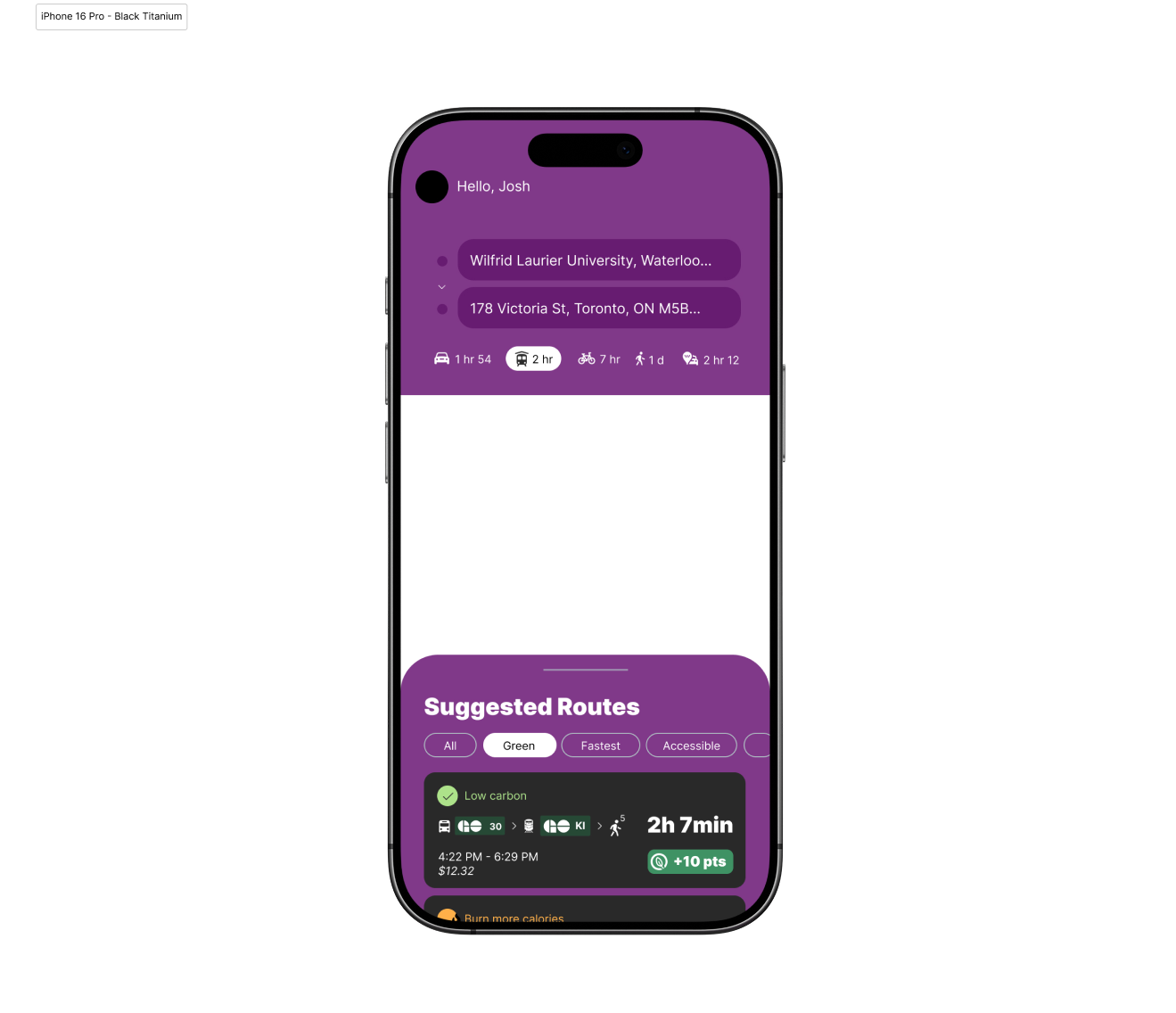
Feedback from peers and mentors showed that screens lacked a clear visual hierarchy, accessibility options were hard to find, and the purple colour palette didn't align with the app's sustainability focus.
Final Design
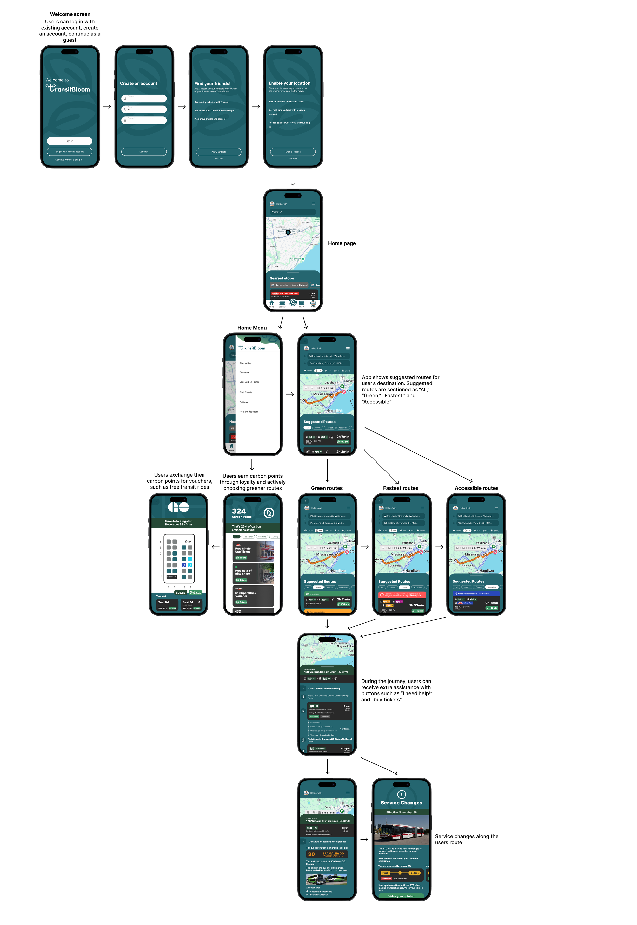
We focused on strengthening usability and visual identity. We shifted from the purple colour palette to a green-teal primary palette for better readability and stronger sustainability branding. We introduced clearer iconography, accessibility toggles, carbon-saving visuals, and an eco-points reward system.
The final wireframe journey below creates an experience that supports users to make greener commuting choices every day!
Redesign using feedback
RESULTS
What I learned
01. Sustainability needs motivation
Many users already care about the environment, but awareness alone does not change behaviour. Clear incentives and real-time reassurance is what drives intention into action.
02. Accessibility must be integrated from the start
Designing for seniors and users with mobility needs helped reinforce the idea that accessibility cannot be ignored. That way, the experience improves for everyone and not just those with specific needs.
03. Small UX decisions help shape our everyday habits
TransitBloom showed me how details such as colour choices and reward feedback can influence trust. Thoughtful UX decisions can make sustainable commuting feel more rewarding and part of a daily routine.